Sunday, 12 March 2017

Pine Marten

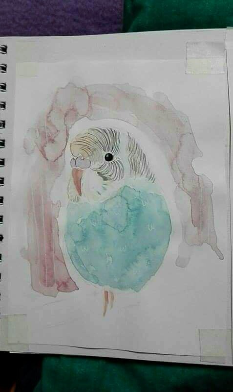
For my research methodology project I decided to look at the Pine Marten. Pine Martens are shy, nocturnal animals that have been extinct from England since the 18th century due to hunting and deforestation. They are still found in Scotland and Ireland and in recent years have been reintroduced to Wales. My research started off with looking at the conservation of these animals and the efforts that are being taken into reintroducing them to Wales and possibly England.

During my research I looked at if the Pine Marten had any myths or legends behind it and found very few, but I did find some Native American creation stories that involved the Pine Marten. Pine Martens are seen within Native American beliefs as a brave warrior and protector especially with the Ojibwe/ Ojibway who had a clan named after it, which had their warriors, builders and strategists in.

One of the stories really stood out to me, Pine Marten's quest for Moon's Daughter, in the story different animals are trying to become Moon's daughters suitors, but to do this they have to pass Moon's challenges. Pine Marten is the only one who completes the first challenge and goes on to the others. The part of the story that caught my attention was the ending were Moon is sent into the sky by Pine Marten were he becomes the Moon. As the original story is a direct translation of  a spoken tale there are quite a few sentences that don't make sense in English. After having a tutorial with Karen Anne we discussed about transfiguring and rewriting the story to fit Irish animals and making it into a children's story book.

My new version of the story went through lots of changes and versions. I made it so Pine Marten is the protagonist of the story whilst Moon is the antagonist, as in the original both of them seemed to be as bad as each other with no messages of good. I made it so the story showed how much Pine Marten loved moon's daughter (Kyna), and how he would do any number of challenges to be able to marry her. In the end during a challenge pine marten is exhausted and fed up and sends Moon into the sky.


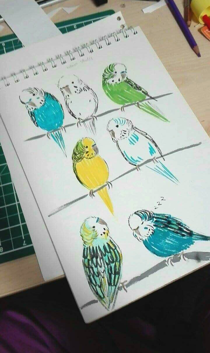
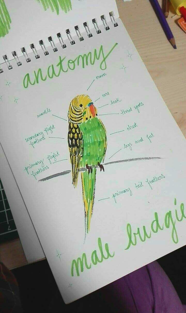
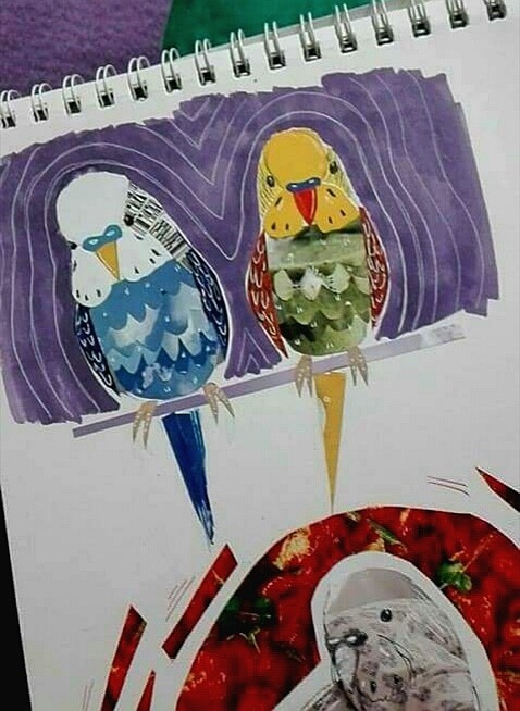
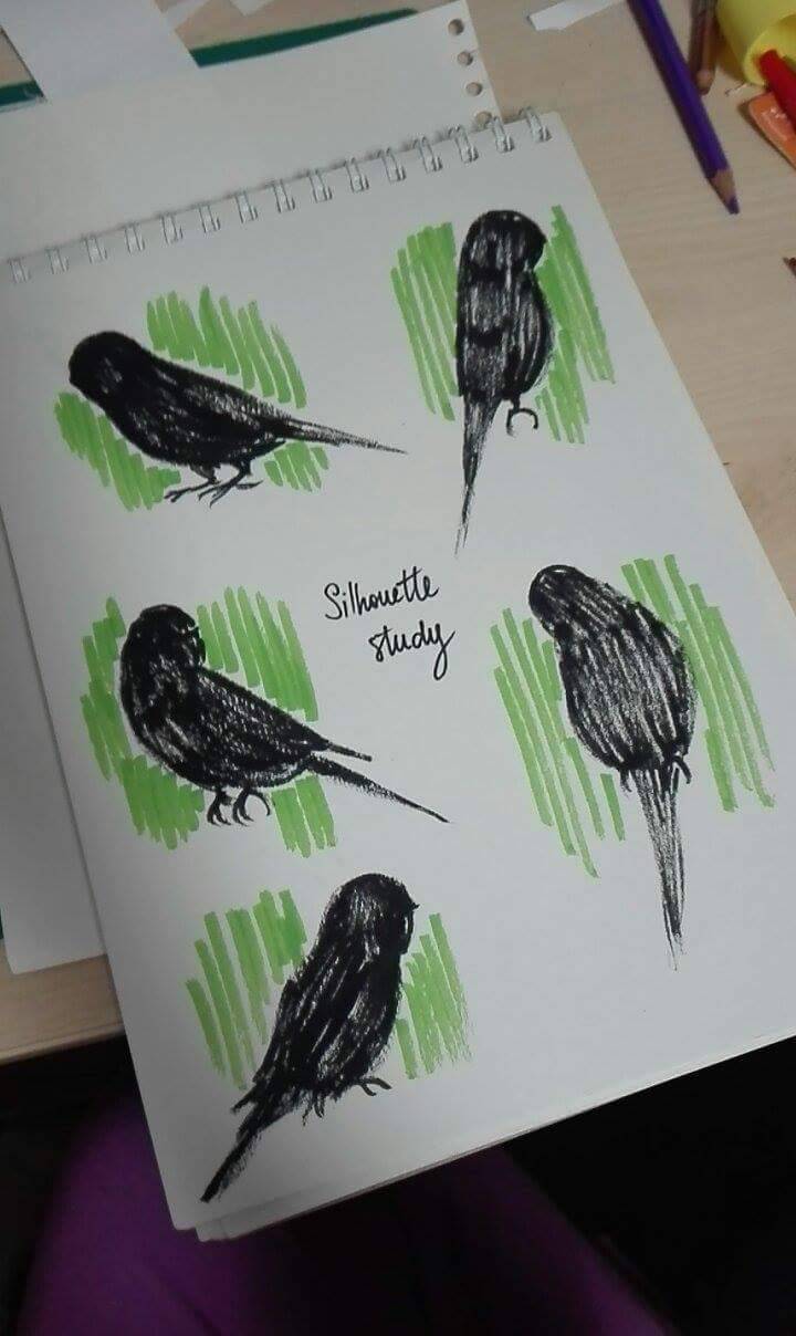
For the double page spreads I made thumbnails of every scene and picked three to illustrate along with a map for the index papers. When designing the characters for the story I got a bit carried away and did roughs of all the characters involved, so I used them and made them into a page introducing the characters to go at the start of the book. I did all of my drawings in black fine liner and scanned them into Photoshop were I then coloured them and added in the text.


Thursday, 9 March 2017

Rat - Jakub Marjanski

I decided to follow the Rat for the project, the reason I took the rat is because the idea of an animal that represents pestilence fascinated me. I instantly jumped to looking at the disgusting side of rats and found that the animal is actually quite clean. I had to look quite hard to find pictures of sewer rats and diseased ones on the streets of New York city. Eventually I collected a range of images that I sketched out.

With that I went on to look up the pestilence part of this project. I looked at depictions of gods and concepts such as the 4 riders of the apocalypse. In my search I found the black death and that it came in 3 different versions that plagued different parts of the world. I decided to make that my main theme.


With that discovery I decided that I should depict the disease moving from one place to the other like it did. In a tutorial I was informed of concertina books, their long length were perfect for the subject.
Final Piece


The final piece was made with 3 cellulose thinner prints of works I have done in my book, each representing the location where black death happened. The in-between parts are transitions made with a Graphite pencil (I also went over the prints with it to make them darker and feel like an old painting). The band around the book was made with a map to add to the travel aspect and the actual book is made with Fabriano paper. It's missing text that was meant to accompany the images but I didn't have enough time to add them to the piece.
The first image represents the Byzantine empire, second Europe and last China.

My Dog Sighs Workshop


In the Free Art Friday workshop I created a ship out of a discarded pamphlet and a leaf. The leaf is the mast whilst the Pamphlet is the ship. The screws were used to create mechanical legs and added a mechanical feel to it.

Tuesday, 7 March 2017

Komodo Dragon - Calvin Squibb

For my Research Methodology project, I decided to focus on the Monitor Lizard or to be more specific the Komodo Dragon. I chose the Komodo Dragon because it is the largest lizard known to man and also because  they have the word dragon in their name. Ever since I was little I have liked dragons and legend behind them and how each culture has different depiction of what a dragon is or look like. My research started with looking into the facts about the Komodo Dragon I did this by borrowing books from the library that  included the history and biology of reptiles hoping that they had information on the Komodo Dragon or Monitor Lizards. I also used the internet to such for information about the Komodo because it is a lot easier to search for information that way. Upon researching the Komodo I found out they share a similar tongue to a snake and that they also use it the same way. I also found out that Komodos can come in a variety colours such as, blue, orange, green and grey. When I found this out I first thought of the chameleon who can also come in a variety of colours. From this new found information I decided to create some prints based around the characteristics of the Komodo Dragon.


After the second tutorial, I started to look more into the biology of the Komodo, as well as how it moves and what its footprints looks like.  Upon research into the biology of the Komodo, I became interested in its skeletal structure and so decided to create an experiment using the foam peanuts that you get from packaging. This is a really easy material to use especially the starch based peanuts because you only have to use water to stick them together. I wanted to carry on using these peanuts because they are easy but I ran out of them and couldn't find a supplier so that I could get more but I think this was a good thing to happen, because even though I thought this outcome was successful, I wanted the final piece show the more robust side of the Komodo Dragon, and through research into other artists I thought of a way that I could create this outcome using metal wire.

Before creating my final I had to plan out what is was going to look like and how I was going to create it using wire. My plan for creating the Komodo was to make a simple wire mesh and to overlay it with a screen printed pattern that resembled the skin of the Komodo. I decided not to do this because of the artist Benedict Radcliffe who creates 3D wire frame models using steel rods. Leaving the wire frame exposed gave his pieces a unique look and so I wanted to recreate this using my own method, and that method involved buying a lot of paperclips and unfolding them that they were straight. since I couldn't use  welds to attach the paperclips together, I used a soft wire so that I could wrap it around two paperclips, joining them together. I felt that using nothing but metal and wire, you would get the feeling of a robust industrial look. Below is what the final wire frame Komodo Dragon looks like; there was no other materials used except paperclips and galvanized wire.


Sunday, 5 March 2017

Frogs

For my Research Methodology project, I chose to study frogs. I found them intriguing in the sense that they were considered either cute pets or horrible creatures - there is no in-between. Aside from their reputation, they are very interesting animals and have so many variations. This post shows a sample of my project and my exploration of frogs.

In my research I investigated the things most commonly associated with frogs. I looked at their patterns, their movements and their noises in an attempt to understand them better to find a way to represent them. First, I looked at the distinctive markings of the common frog, the kind you're likely to find in your garden. I experimented with different mediums to find the best way to represent the texture and patterning of a frogs skin. I found watercolour to work particularly well as it had a softer effect that suited the subject.


I also experimented with etching to create the patterns of frog skin. I tried the standard form of etching and found that the pattern edges were too harsh and bold. In the example shown, I used diluted watercolour paint over the dried ink to add a green tint to the etch, adding a little colour. Despite this, the darker patches of the pattern still look harsh. My second etching attempt was much more successful and had a more natural-looking finish. For this plate, I removed the ground for the patterning with a pencil eraser which removed it unevenly and gave the faded outline to the marks. I then treated and inked up the plate as normal and found that the ink collected in the uneven patterns, then forming darker areas on the print which looked great. The print shown is my favourite of those taken from the second plate as it showcases the pattern brilliantly but still maintains as an overall image of a frog.


This next image is of my piece from the mechanical animals workshop. In this session, we were encouraged to create a representation of our chosen animal created out of mechanical elements. In my piece I really wanted to convey the frogs hopping movement in the springs under its feet and the powerful legs crammed with gears and other machinery. The springs might look comical, but they communicate my message well.

In the last image, you can see my piece from the workshop led by guest lecturer My Dog Sighs, inspired by his Free Art Friday initiative. The workshop encouraged students to find a piece of litter and to rework it as a piece of art. Students used cans, bottle caps and scraps of paper for their work. I found a seed from a sycamore tree and thought it looked a lot like a tadpole. I then used acrylic paints to paint the seed as a tadpole, with the markings and a little eye. I think this piece is very effective, and is a good representation of a tadpole.

Owls

I focused on owls for my research methodology project.
I looked at their symbolism in various cultures and their association with witches. They are thought to be messengers of witches, and it's also believed that witches themselves can turn into owls. They symbolize wisdom and foresight and are thought to be keepers of secrets and knowledge. Athena, the Greek goddess of wisdom and strategy, had an owl as her symbol. According to myth, an owl would sit on her blind side, so that she could see the whole truth.
Owls are often associated with death and bad omens; however, they are also associated with dreams and psychic awareness. I focused a lot on owl associations and representations, especially their symbolism in dreams and divination. I was interested in the mysticism of owls and their place in the old world.


My Dog Sighs Workshop

Thursday, 2 March 2017

Scarabaeidae; Celestial Navigators - Lucy Bertram

Beginning the Research


Extract from the 'Dictionary of Symbols' and watercolour studies

I chose to study the insect family by the name of Scarabaeidae, or most commonly known as the Scarab family. This is a family of beetles that makes up around 10% of all insects and therefore is incredibly wide spread. Some of the most common beetles under the Scarabaeidae term are Dungbeetles, Cockchafers and even the so called 'Thunder bugs' which are drawn to incredibly bright colours during summer. I was fascinated by this super family and began my research by finding a dictionary definition of 'Scarab' and exploring a few different ways to portray the most widely known type of scarab. Within my research, one thing that would crop up every few passages was their connection to the ancient Egyptians, whom believed that the Scarabs had eternal life, reincarnated through the balls of dung they would roll. They were often depicted in images laced with gold and therefore I chose to do the same thing, use golden paint to highlight certain areas of their bodies.


Acrylic paintings with Liquid Leaf golden highlights

Celestial Navigation


Watercolour and salt painting. Liquid leaf golden highlights

After completing some further research by contacting Entomologist, Moya Burns, I discovered that this super family had the ability to Navigate using the stars, which is something that utterly fascinated me. I researched how we, as humans could achieve the same thing. Scarabs navigate differently to us, they are able to do so using the milky way but, we as humans rarely have strong enough eyes to do this without technical support.

Developing the Final Piece

During a tutorial I realised that the thing I wanted to depict about these creatures was my fascination with their navigation skills, this brought me to the Victorian circus posters which often promised the experience to see something never seen before, something spectacular, when in reality the shows weren't as exciting as promised. I felt the same about these Scarabs, they had an amazing ability but, if faced with one, it would be far smaller than expected and probably wouldn't move whilst you were there. I wanted to use this to my advantage and set out to produce an A2 poster that promised grandeur.

The Final Piece


Final A2 poster.

The final piece was completed in 4 different stages, the painting of the actual base, the adding in of the celestial chart through photoshop, the printing onto an A2 sheet and then the addition of the golden paint. Almost entirely central in this piece is the star Polaris which is the brightest and most northern point in our skies within the northern hemisphere. The gold bands around the scarabs shell represent the equator which separates the northern and southern hemisphere so that there is no confusion about whether the two constellations (which represent how we, as humans can navigate using the night sky) are connected to one another.

Wednesday, 1 March 2017

Ladybirds

Acrylic ladybird illustrations
For the Research Methodology unit I decided to look into ladybirds as they are my favourite insect and commonly associated with Britain's gardens. With the painting above I wanted to illustrate the delicacy shown through the insects size and features; I chose to do this through the medium of acrylic paint in order to utilise the vivid colours shown on the ladybird's body.
Warhol inspired lino print edit

After researching into the works of Andy Warhol for his use of bright colour and repetition, I decided to experiment with lino printing as it's a medium I had not used before. I used a black ink to print and then scanned the image into photoshop in order to change the colours making the ladybirds bright and bold, juxtaposing the stereotypical colours associated with ladybirds.
                                                                       
As part of my research process I began to look into the decorative pattern of the polka dot - which is my favourite pattern and is a key association to the ladybird. Here I made hanging circular pendants using acetate after being inspired by the artist Olafur Eliasson and his installations highlighting light and circles. I took this notion and combined it with the idea if the ladybird to create this composition with the ladybird painting being shown to hang in suspense within the piece.

               
'Ladybird Interior Collection'
The research into the decorative pattern of the polka dot lead me towards my final outcome 'The Ladybird Collection' where I made a set of four interior accessories: a cushion, lamp, door knobs and wallpaper. Research into a ladybirds habitat portrayed the negative connotations in the media of ladybirds within the home; I wanted to take this idea and turn it into a positive. I made the collection by fabric printing, up cycling and utilising old materials within the home which all had red polka dots and ladybirds making the collection stand out as a whole.

Budgie - Oana Iolea

My chosen animal for my latest project entitled Research Methodology was a budgie. The main reasons why I chose it is because I used to own two budgies that I loved very much and ever since they came into my life, my love for birds has grown more and more. I started off the project by doing some research about the tiny bird therefore I filled my sketchbook with information about their anatomy, diet, etymology, colour mutations and many more!


 After creating this base of research, I started experimenting as much as possible using every working technique I was comfortable with, such as watercolour, collage, simple pencil sketches and origami.


My next step was attending my tutorial with Karenanne who helped me a lot by coming up with multiple interesting ideas for my final piece. Out of the three main ideas, I decided to focus on the one related to combining collage and origami and I can say that I'm pretty happy with the final result.


Jaguar - Lucy Ward

Research Methodology on the Jaguar


Continuous Line

For Research Mythology I chose the Jaguar as I wanted to focus on the fur and their tendency to eat the Yage vine which causes them to hallucinate, I combined the two main focuses for my final outcome by making a psychedelic felt piece representing how the jaguar sees itself and its surroundings.

Koi fish - Sergi Traverso


For research methodology I chose koi fish due their vibrant colours and patterns and my fascination with the waterfall legend.


Mechanical Animal workshop work - Koi fish

My Dog Sighs - Lost and Found workshop

My take on a ship in a bottle for the lost and found workshop using an empty canister from a cream dispenser I found outside.

Bears - Florence Mackintosh

For the Research Methodology project I chose to look at bears. To begin the project I did some research into all eight species of bears, before focusing more specifically on the two species I was particularly interested in - the grizzly bear and the moon bear. I was interested in the bear's habitat and did some research on Yellowstone National Park, which involved reading articles and watching documentaries to familiarise myself with the visuals of the landscape and the way in which bears move and behave, as well as visiting the Natural History Museum in London to gather some first-hand research. 


My findings from my research into Yellowstone led me to explore further the relationship between bears and humans. I looked at the long history of bear cruelty, learning about dancing bears within the Romani culture and how, in some parts of the world, the practice of training bears for circuses and the capturing of bears for bile farms is ongoing. I thought about how I could portray the stories of these captured bears and an initial idea I had was to write and illustrate a book for children.


During the process of developing my idea I thought about how some children's books illustrators expand their product further by creating merchandise along side their book. My idea was to create a brand, inspired by the name 'Moon Bear', which had appealed to me visually, particularly for a brand targeted at children. I went on to develop ideas for products I could make for a nursery collection - cushions, babygrows, wallpapers and framed prints. I realised this idea through fabric printing for the cushions and babygrow, and using photoshop to develop designs for the print and wallpaper samples. 


Towards the end of the project my focus became much more visual than contextual. I was interested in the aesthetics of the products I was making - the lines and colours as well as the media and materials. Although the story book was not my final outcome, it was an important part of the process in developing the 'Moon Bear' collection. I would not have been able to do this as successfully without thoroughly researching the subject of bears.

Free Art Fridays


From our workshop with My Dog Sighs I created a pop art influenced piece using a nos canister and a piece of rubble found on the floor.