Sunday 5 March 2017

Owls

I focused on owls for my research methodology project.
I looked at their symbolism in various cultures and their association with witches. They are thought to be messengers of witches, and it's also believed that witches themselves can turn into owls. They symbolize wisdom and foresight and are thought to be keepers of secrets and knowledge. Athena, the Greek goddess of wisdom and strategy, had an owl as her symbol. According to myth, an owl would sit on her blind side, so that she could see the whole truth.
Owls are often associated with death and bad omens; however, they are also associated with dreams and psychic awareness. I focused a lot on owl associations and representations, especially their symbolism in dreams and divination. I was interested in the mysticism of owls and their place in the old world.


My Dog Sighs Workshop

Thursday 2 March 2017

Scarabaeidae; Celestial Navigators - Lucy Bertram

Beginning the Research


Extract from the 'Dictionary of Symbols' and watercolour studies

I chose to study the insect family by the name of Scarabaeidae, or most commonly known as the Scarab family. This is a family of beetles that makes up around 10% of all insects and therefore is incredibly wide spread. Some of the most common beetles under the Scarabaeidae term are Dungbeetles, Cockchafers and even the so called 'Thunder bugs' which are drawn to incredibly bright colours during summer. I was fascinated by this super family and began my research by finding a dictionary definition of 'Scarab' and exploring a few different ways to portray the most widely known type of scarab. Within my research, one thing that would crop up every few passages was their connection to the ancient Egyptians, whom believed that the Scarabs had eternal life, reincarnated through the balls of dung they would roll. They were often depicted in images laced with gold and therefore I chose to do the same thing, use golden paint to highlight certain areas of their bodies.


Acrylic paintings with Liquid Leaf golden highlights

Celestial Navigation


Watercolour and salt painting. Liquid leaf golden highlights

After completing some further research by contacting Entomologist, Moya Burns, I discovered that this super family had the ability to Navigate using the stars, which is something that utterly fascinated me. I researched how we, as humans could achieve the same thing. Scarabs navigate differently to us, they are able to do so using the milky way but, we as humans rarely have strong enough eyes to do this without technical support.

Developing the Final Piece

During a tutorial I realised that the thing I wanted to depict about these creatures was my fascination with their navigation skills, this brought me to the Victorian circus posters which often promised the experience to see something never seen before, something spectacular, when in reality the shows weren't as exciting as promised. I felt the same about these Scarabs, they had an amazing ability but, if faced with one, it would be far smaller than expected and probably wouldn't move whilst you were there. I wanted to use this to my advantage and set out to produce an A2 poster that promised grandeur.

The Final Piece


Final A2 poster.

The final piece was completed in 4 different stages, the painting of the actual base, the adding in of the celestial chart through photoshop, the printing onto an A2 sheet and then the addition of the golden paint. Almost entirely central in this piece is the star Polaris which is the brightest and most northern point in our skies within the northern hemisphere. The gold bands around the scarabs shell represent the equator which separates the northern and southern hemisphere so that there is no confusion about whether the two constellations (which represent how we, as humans can navigate using the night sky) are connected to one another.

Wednesday 1 March 2017

Ladybirds

Acrylic ladybird illustrations
For the Research Methodology unit I decided to look into ladybirds as they are my favourite insect and commonly associated with Britain's gardens. With the painting above I wanted to illustrate the delicacy shown through the insects size and features; I chose to do this through the medium of acrylic paint in order to utilise the vivid colours shown on the ladybird's body.
Warhol inspired lino print edit

After researching into the works of Andy Warhol for his use of bright colour and repetition, I decided to experiment with lino printing as it's a medium I had not used before. I used a black ink to print and then scanned the image into photoshop in order to change the colours making the ladybirds bright and bold, juxtaposing the stereotypical colours associated with ladybirds.
                                                                       
As part of my research process I began to look into the decorative pattern of the polka dot - which is my favourite pattern and is a key association to the ladybird. Here I made hanging circular pendants using acetate after being inspired by the artist Olafur Eliasson and his installations highlighting light and circles. I took this notion and combined it with the idea if the ladybird to create this composition with the ladybird painting being shown to hang in suspense within the piece.

               
'Ladybird Interior Collection'
The research into the decorative pattern of the polka dot lead me towards my final outcome 'The Ladybird Collection' where I made a set of four interior accessories: a cushion, lamp, door knobs and wallpaper. Research into a ladybirds habitat portrayed the negative connotations in the media of ladybirds within the home; I wanted to take this idea and turn it into a positive. I made the collection by fabric printing, up cycling and utilising old materials within the home which all had red polka dots and ladybirds making the collection stand out as a whole.

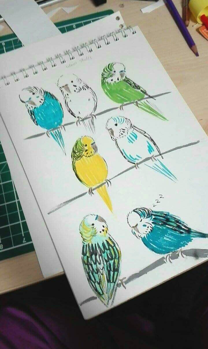
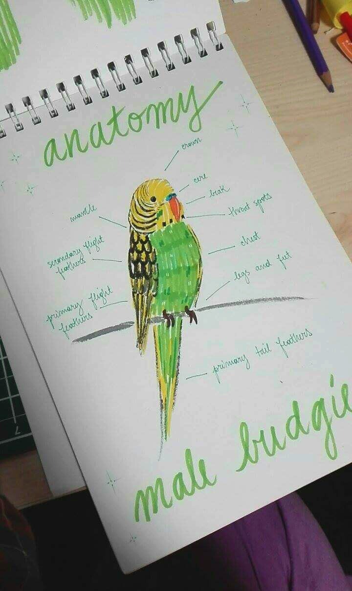
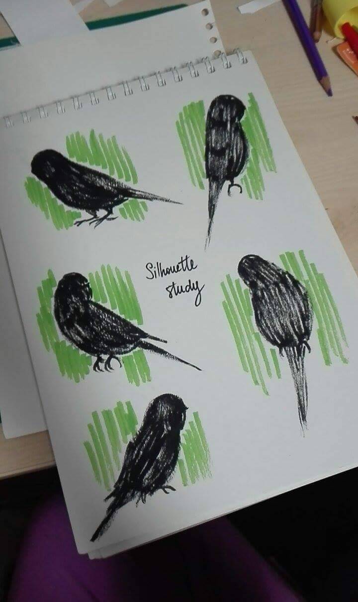
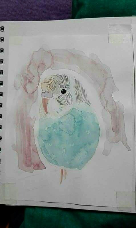
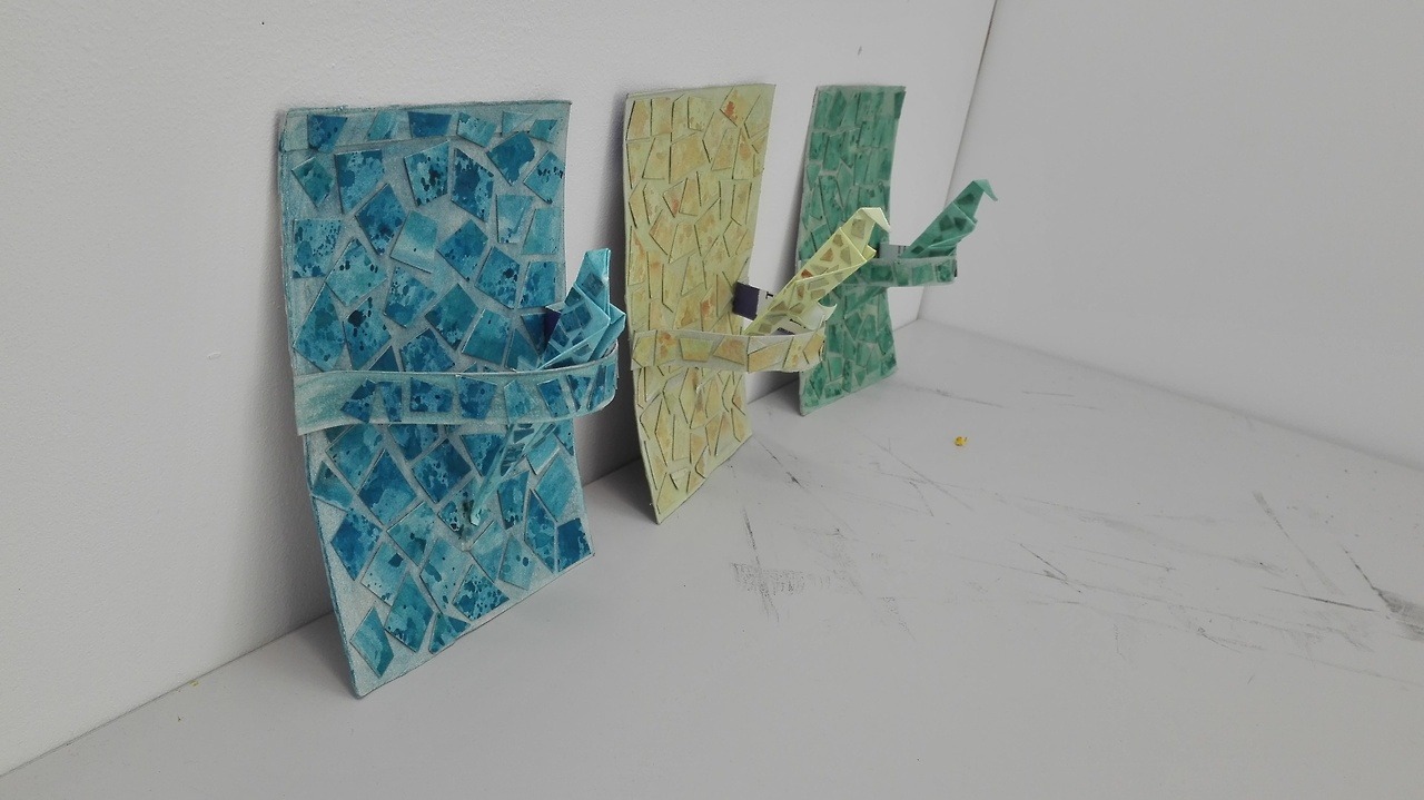
Budgie - Oana Iolea

My chosen animal for my latest project entitled Research Methodology was a budgie. The main reasons why I chose it is because I used to own two budgies that I loved very much and ever since they came into my life, my love for birds has grown more and more. I started off the project by doing some research about the tiny bird therefore I filled my sketchbook with information about their anatomy, diet, etymology, colour mutations and many more!


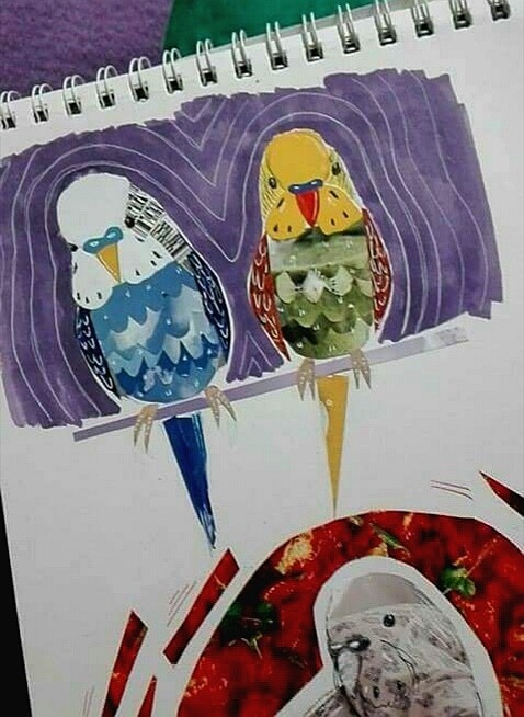
 After creating this base of research, I started experimenting as much as possible using every working technique I was comfortable with, such as watercolour, collage, simple pencil sketches and origami.


My next step was attending my tutorial with Karenanne who helped me a lot by coming up with multiple interesting ideas for my final piece. Out of the three main ideas, I decided to focus on the one related to combining collage and origami and I can say that I'm pretty happy with the final result.


Jaguar - Lucy Ward

Research Methodology on the Jaguar


Continuous Line

For Research Mythology I chose the Jaguar as I wanted to focus on the fur and their tendency to eat the Yage vine which causes them to hallucinate, I combined the two main focuses for my final outcome by making a psychedelic felt piece representing how the jaguar sees itself and its surroundings.

Koi fish - Sergi Traverso


For research methodology I chose koi fish due their vibrant colours and patterns and my fascination with the waterfall legend.


Mechanical Animal workshop work - Koi fish

My Dog Sighs - Lost and Found workshop

My take on a ship in a bottle for the lost and found workshop using an empty canister from a cream dispenser I found outside.

Bears - Florence Mackintosh

For the Research Methodology project I chose to look at bears. To begin the project I did some research into all eight species of bears, before focusing more specifically on the two species I was particularly interested in - the grizzly bear and the moon bear. I was interested in the bear's habitat and did some research on Yellowstone National Park, which involved reading articles and watching documentaries to familiarise myself with the visuals of the landscape and the way in which bears move and behave, as well as visiting the Natural History Museum in London to gather some first-hand research. 


My findings from my research into Yellowstone led me to explore further the relationship between bears and humans. I looked at the long history of bear cruelty, learning about dancing bears within the Romani culture and how, in some parts of the world, the practice of training bears for circuses and the capturing of bears for bile farms is ongoing. I thought about how I could portray the stories of these captured bears and an initial idea I had was to write and illustrate a book for children.


During the process of developing my idea I thought about how some children's books illustrators expand their product further by creating merchandise along side their book. My idea was to create a brand, inspired by the name 'Moon Bear', which had appealed to me visually, particularly for a brand targeted at children. I went on to develop ideas for products I could make for a nursery collection - cushions, babygrows, wallpapers and framed prints. I realised this idea through fabric printing for the cushions and babygrow, and using photoshop to develop designs for the print and wallpaper samples. 


Towards the end of the project my focus became much more visual than contextual. I was interested in the aesthetics of the products I was making - the lines and colours as well as the media and materials. Although the story book was not my final outcome, it was an important part of the process in developing the 'Moon Bear' collection. I would not have been able to do this as successfully without thoroughly researching the subject of bears.

Free Art Fridays


From our workshop with My Dog Sighs I created a pop art influenced piece using a nos canister and a piece of rubble found on the floor.

Tuesday 28 February 2017

Llama - Emma West

Creating my own Peruvian style patterns

My chosen animal for Research Methodology was the llama! I chose it because of its characteristically quirky and humorous nature and appearance. I was also given the nickname 'llama' a few years ago by my friends (to this day I still don't know why!) - so I figured it would be fun to work with an animal that I had some association with. My initial thoughts on how to approach this project would be gaining more information about them and the environment that they live in, which led me on to researching about Peru and its culture. This also prompted some historical research in the 'Incas' - in which I learnt about the multicolour llama deity 'Urcuchillay' and the importance of textiles in their culture and traditions. From here I experimented with creating my own Peruvian style patterns, and incorporated a lot of vibrant colours into llama drawings - inspired by both Peruvian culture, Andy Warhol's pop art work and the Fauvist movement. 

Through my experiments and cultural research influence I decided to take a textile based route, thinking about how I could use sewing, knitting and other wool based crafts. The five words I chose allowed me to have some real fun with experimentation and idea development, from the beginning of the project I knew that I wanted to create something fun and colourful. The five words I chose were Quirky, Goofy, Proud, Rugged and Colourful, all of which relate to their appearance and characters, as well as cultural roots. 


Embroidery experiments


Using textiles was a really good choice, it allowed me to re-familiarise myself with machine sewing and I got to revisit experimenting with embroidery which I enjoy doing in my spare time. The final pieces turned out exactly how I wanted them to! Together they encompass the five words and summarise the colourful, quirky nature of llamas. The two embroideries feature colourful patterns inspired by Peruvian textiles, displayed within the llamas coats to reflect on their home country and the culture of it. The weave is a physical representation of the llamas rugged coats combined with Peruvian inspired colours, Tulunpi ear decorations and pom poms they are adorned with during festivals. The three googly eye prints are a response to Andy Warhol's 'Marilyn Monroe' print, duplicating and varying colour palettes to create individual characters whilst adding some extra fun and humour to the llamas. 

Final pieces on the wall together!


Fish - Micky Orchard


During my Research Methodology project, my work focused on fish. In my opinion, fish are very interesting for various reasons, such as their colourful and shiny scales, and the incredibly diverse shapes and sizes they come in, ranging from a great white shark, to the tiny goby, which is about the size of your finger nail. Starting off, I began looking at the anatomy and biology of fish. I did this by drawing visually diverse fish species, such as the thin mackerel, or the blob like trunk fish. I also researched different types of fish scale, and researched how their gills work. In short, they take in water into their gills, then oxygen is extracted from the water, then flushed back out.  

After the first tutorial, I began researching a lot more things in relation to fish. I also had the opportunity to experiment with a wide range of materials, such as the Wacom Cintiq, a graphics tablet where you can draw directly onto the screen. The Wacom Cintiq tablet is a piece of equipment that really interests me as a wannabe digital painter. During the project I created various illustrations using this tablet, such as the image below, a visual experiment from my research into skittish fish behavior. It is inspired by the African Trout, which are known as particularly skittish fish, due to the abundance of predators in Africa, such as cormorants, otters and humans. 

In order to explore new research methodologies, I created a survey which I shared online for other people to answer. I used the survey to get peoples opinions on a range of topics regarding fish. From the survey I came to the conclusion that most people only really cared about fish in terms of food and keeping as a pet. Some stated they were important as they keep the marine environment clean. Therefore from the survey, I wanted to further explore themes of marine ecology and the effects of water pollution. I wanted to make something visually communicative that might take the appearance of a visual metaphor and subtly shock people about the impact of water pollution.

The most interesting of my five words i researched were "Struggling" and "Diversity". An article from Credo told me how pollution was responsible for an alarmingly high amount of fish species extinction. Below is one of the visual experiments from the five word methodology, an image that shows both fish diversity, and the struggle of water pollution, represented by the littered pattern on the fish and how fish are having to adapt to these polluted environments and die due to mutations or habitat loss.

With this I found something I wanted to communicate. After researching all of my words, I decided to take what I had learned from these two further. That water pollution is heavily affecting marine ecology and is responsible for reducing diversity in fish species, as most species are dying out. After evaluating multiple ideas I decided to create a communicative sculpture which would act as a visual metaphor and communicate to people how drastically pollution is affecting marine ecology and the diversity of fish species.


The sculpture itself is made up of a slate base, and an arch made from two driftwood pieces. I added both natural and unnatural elements to the sculpture, to show how the ecosystem is drastically changing due to pollution, such as shells, barnacles, fishing wire and glass. The sculpture itself communicates the effects on the ecosystem well, however the two aluminum fish communicate the effect of pollution on fish diversity and biology well. There are only two fish, and both are made of the same materials, and are exactly the same shape. This subtly communicates how fish have to adapt to the pollution, as well as visually representing a lack in diversity, again due to pollution. The fact that they are made of cider cans communicates fish mutation, which I learned about from a Credo article, which is one of the key reasons why diversity is decreasing, fish are mutating and dying due to their polluted waters. I hope that my sculpture will bring this to people's attention and shock them about the frightening truth. 

The Human - Sam Hely

I decided to be a little different with this project and look into the animal of a human, which is under the umbrella classed as a mammal.
The specific area I decided to look into was that of the brain and how different people can behave in different ways compared to others.  I began by looking in the general structure of the human skull.
This is a charcoal and chalk drawing I produced to represent the skull.

After this point I began to look into the idea of how a murderers brain could be potentially different to that of a person who has not committed a murder, so from here I started exploring the concept of forensic science, in particular, the use of a fingerprint detection.
So from this point I decided that to try and back up the idea of using finger prints, I needed to try this myself.  Using a few different mediums to get the best possible fingerprint print, this image was using the media of lino block ink.

From here i began to explore the idea that there are many films which would include the thoughts of murderers and films that contain murderers, this is where I entered the print room and created an etch.
The etch was from the film A Nightmare on Elm Street and I decided to try and recreate the hand of Freddy Kruger, the infamous dream killer.

My final image comes from the inspiration taken from a workshop with My Dog Sighs.  During the workshop i created a doll that had been savagely attacked, but was left hanging with a suicide note, which left it on a cliffhanger as to whether he committed suicide or was in fact murdered.
After drawing the image into a scratch board, I then uploaded the image into Photoshop and inverted the image and coloured the eyes to try and make the drawing a little more life like.


Wednesday 22 February 2017

Fox - Charlotte Vine

My Research Methodology project was focused on the Japanese folklore surrounding the Fox (or Kitsune in Japanese). Kitsune in Japanese mythology are intelligent beings who posses magical abilities that increase with their age and wisdom. Most importantly they are commonly known to be shapeshifters, who can transform into human beings using their power source 'Hoshi no Tama' (translated as 'Star Balls'). My primary goal was to create a narrative depicting the transformation of the Kitsune. Firstly, I had to research into how transformation could be displayed. Most of this research comprised of the concept art for the Harry Potter film franchise which included many humans turning into various creatures and vice versa. After this, I attempted to create my own transformation sequence of a human becoming a fox:


I found that the in between stages in my illustration, displayed on a page permanently rather than quickly sifted through like in film or animation, looked very awkward and strange. Thus I later decided after I had written the plot for my story that I would have the transformation happen in a particular way so that the awkward in between stages could not be seen by the viewer.

I decided to do this by using the pond the humans protagonist is sitting by in this scene, The Kitsune would jump in one end as a fox and appear as a human at the other, leaving the readers to fill in the blanks using their imaginations.To imply a transformation was happening, I wanted to show patterns forming on the surface of the water. To find out what textures and patterns I could use, I experimented with how water and ink act together. First by photographing the patterns formed once ink was dropped into water, then adding ink to existing droplets on a page and letting it dry overnight. Thinking about texture in terms of transformation, I had to think how texture could symbolise a smooth surface (skin) changing to a fluffy one (fur). After experimenting with different patterns in varying media, I found microscopic images of human skin and fox fur. I also gathered some images by photographing water, and observing the surface patterns. This research concluded with a gouache painting that symbolised the fox / human transformation, utilising a combination of the textures I had created and seen:


These patterns were then utilised in the final comic on the surface of the water to imply transformation (see below).

This project also included character design, how could I portray the qualities of the Kitsune in a single character?


After having created some rough sketches of what I thought the two protagonists could look like, I decided to look into name symbolism, as symbolism within a character’s design is very crucial to me and can be very insightful and interesting. I decided to give the Kitsune a unisex name (Yuu, which means gentleness, lithe, superior (very much fox features)) and an androgynous appearance to draw parallels with the fox in the sense it is very hard to tell males and females apart. His human form has many fox features: long face, high cheek bones, slight slant of the eye and slightly pointed ears. I have also drawn upon an earlier idea to have markings on the face that remain in both fox and human form. Yuu’s colour palette is symbolic, with his hair being white (an auspicious colour) and clothing being blue (meaning purity). Finally, here is an excerpt of the final comic scene I illustrated, depicting the transformation from fox to human:

Tuesday 14 February 2017

Lost and Found Workshop

This is Freddie, created through a workshop with My Dog Sighs.  Made using string, ink and charcoal, was Freddie murdered or did he commit suicide?  I guess we will never know as he disappeared from where he was hung...